BI Dashboarding
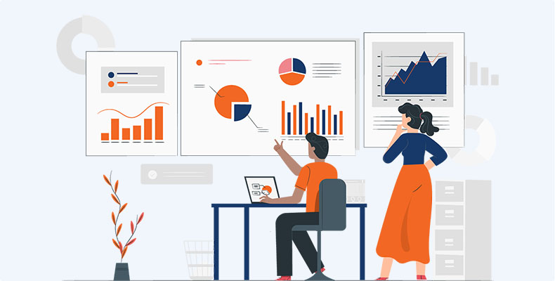
Business intelligence dashboards are information management and data visualization solutions used to analyze your data. Content creators can use interactive elements like filters and actions to combine charts, graphs and reports in a single screen for snapshot overviews. Dashboards are one of the most popular capabilities of BI platforms because they present easily understandable data analysis, allow you to customize which information you want to view, and provide a way to share the results of your analysis with others.
A BI dashboard is an interactive visualization method for displaying different types of data for business operations on various scales.
Dashboards–sometimes called IT dashboards or corporate dashboards–are single screens in which various critical pieces of information are placed in the form of panels. If a dashboard is useful, a Web-based dashboard is even more so. Blending the power of a desktop application with the flexibility and the navigability of the Web.

Benefit of Services
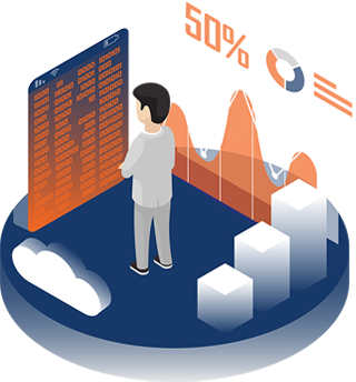
A BI dashboard is an easy-to-understand, visualised summary of data analysis that provides an at-a-glance overview of multiple areas of the business. There are many significant benefits of implementing BI dashboards into your operations including:
- Enhanced visibility
- Timesaving efficiency
- Better forecasting
- Key performance indicators
- Inventory control
- Real-time customer analytics
- Better decision-making
What Is Included
- Monitor business performance
- Highlight key data points (KPIs)
- Identify opportunities
- Discover the story behind the data
- Make data-driven informed decisions
- Enables the use of embedded self-service BI applications by industry analysts
Here is a basic explanation of the difference:
- Dashboards are generally summary-focused. Reports generally data-focused.
- Dashboards are more visual and use various data visualization components. Reports are generally more tabular.
- Dashboards focus on analytical metrics and KPIs. Reports focus on the data behind these metrics.
- Dashboards can be understood with a brief overview. Reports typically require more in-depth analysis.
- Dashboards are generally consumed on the web and provide high interactivity. Reports can be consumed on paper or on the web and provide little interactivity.
Keep these in mind when designing your own BI dashboards:
- Design for the target audience. Customize the dashboard so that the target audience has only relevant information.
- Provide context. Ensure that data—like sales or profit—includes essential milestone dates or year-over-year comparisons so stakeholders are able to understand trends.
- Drive actionable insights. Ensure the visualization displays information that helps stakeholders make decisions.
- Avoid clutter. Less is more! Don’t pack too many visual elements into one dashboard.
DataMaticsLab offers dashboards to help users become proficient with our platform.
